
.png)
Mastering Palette Knife Painting Techniques: A Step-by-Step Guide for Beginners 🎨

As the summer heat settles in, one of the best things you can do is get your friends together and have a paint and sip night. During this time, everyone can be involved either by choosing colors to decorate the items, painting on the actual item, or even generating creative names of the pastel colors used. This is indeed a great opportunity for friendship bonding, relaxation, and getting a feel of art. Let us have a look at how we can carry out the paint and sip event. Pallet knife painting is a wonderful option if you want to learn a new and exciting painting technique. Thanks to this guide, you will realize the essential steps to achieve fantastic art with a palette knife. Contrary to what you might think, the above techniques are not for the advanced artist only. They will indeed help you develop textured and colorful pieces no matter what your current skill level is. Why don't we start doing it?
Step 1: Preparing Your Canvas 🖌️
Just like the motto states, "A good start is half the battle." The first and foremost step in painting is to prepare your canvas. You should first decide on the canvas size that suits your artwork the best. For novice painters, I suggest a medium-sized canvas as it can be handled with ease. Besides, you need to ensure that it is stretched and primed so that you can start creating right away.
Step 2: Choosing Your Colours 🌈
The focus of this artwork will be the sky and the ground, which will be created with a high degree of beauty. Your first step is to choose the colors you want.
Turquoise Deep
Cobalt Blue
White
Burnt Amber
Naples Yellow
Scarlet Lake
These colors will provide a vibrant palette for your artwork. If you're new to color mixing, check out my Acrylic Colour Mixing Guide [FREE] for tips.
Step 3: Painting the Sky ☁️
Rackeren me-sky dabǝ! I mean, after using the palette knife to put on your canvas surface the top section with a thick amount of turquoise deep mixed with white, you should blend the colors directly on the canvas for a better effect. It is only logical. Don't you agree with me?
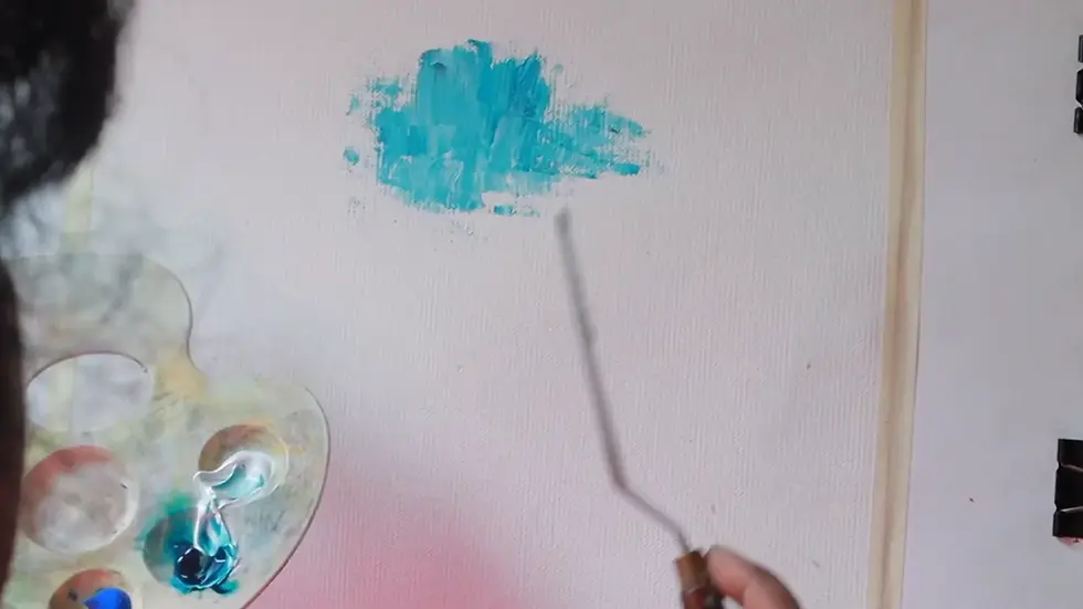
The layer should be thick and you should not drag or over-blend the colors. The aim is to create a bright center that fades to darker shades at the edges. You can easily mix the colours as acrylics have a slower drying time.
Then, bring in the cobalt blue and white at the intersection of the colours. Mix just enough to create an impeccable transition while retaining the original shades. Beware of excessive mixing; we would like to keep the brightness of every color.

Step 4: Adding the Ground 🌍
At the moment, we are proceeding to the ground. Before the ground horizontal line is drawn, it is essential to clean the palette knife properly to avoid accidentally mixing colors. For this line, burnt umber will serve to create a very clear line depicting the horizon sky from the earth. This division dabs your painting's depth, hence it separates the sky from the ground.

To make it more appealing, put yellow and orange together at the base. The warm shades will go with the colder sky colors wonderfully. For the center, take Naples yellow with a bit of white, and apply the paint to the canvas directly without mixing it on the palette beforehand.

Step 5: Creating Water Reflections 💧
Adding a water element will be easy if you use the sky colors. This will be a harmonious look of the two. Use sky colours in a lighter layer on the water area, remembering to leave some of the darker brown for the water line definition at the edges.

The most credible way to do this is to firstly wait for this layer to completely dry before proceeding to the next application.
Step 6: Layering Techniques 🔄
The moment your base layers are completely dry, you can proceed to the next step of detailing your piece of art. At this point, layering is introduced. The first step in defining your huts is to use the side of your palette knife to do this. You may also want to select dark colours that are going to make a catchy contrast with the light background.

While you chisel away at the huts, it is important to pay attention to the amount of pressure you press with your knife. Excessive force can cause the blending that you don't want, therefore, it is better to keep it light for sharper and clearer edges.
Step 7: Adding Details and Textures 🌳
Next, include some decorations such as trees and people. For detailing smaller elements like these, use a detailing palette knife that is smaller for getting more control. First of all, for the figures and the ambient, the objects you must set them in your work. Instead of being figurative, they should be kept abstract as it is all about implying and not being perfect.

To form the texture of leaves on trees, use a curved palette knife by mixing green with burnt umber together. This will be a way to create depth and interest in your painting.
Step 8: Finishing Touches ✍️
When all is done, and you are satisfied with your painting, you should take a moment to step back and look at it from a distance. To make it more realistic, attach some shadows beneath the figures and the huts that will make them appear more dimensional. Use a mixture of darker brown to scrape off the paint and form the missing depth.

Most importantly, make sure to sign your name to your artwork! Let your painting dry completely before you display it.
Step 9: Common Mistakes to Avoid 🚫
In the forthcoming tutorial, there will be a discussion on the most common mistakes that artists make with the use of palette knives as well as avoid. The ideas brought up in the article will lead you to be a more consistent painter. So do not forget to subscribe for notifications!
Step 10: Explore More Resources 📚
To further enhance your painting skills, consider downloading my Top 25 Tips for Beginners. This guide is packed with valuable information to help you improve your acrylic painting techniques.
For a list of recommended supplies, check out my Kit for both budget and premium materials.
Painting with a palette knife is a fulfilling and fun route that creativity and expression can take you. I trust the guidance will help you initiate your artistic expedition. Wishing you the best in your painting endeavours!


b52 nhìn kiểu như mấy trang giải trí mình từng lướt trước đây, nhưng đỡ làm quá nên đỡ mệt mắt. Mình mở ra chỉ định xem sơ sơ thôi, vậy mà kéo xuống vài cái là đã biết mình đang ở mục nào. Bố cục dùng mấy khối nội dung tách bạch, nhìn vào là thấy rõ ràng, không bị dính chữ vào nhau như cháo. Mình thích kiểu họ để thông tin theo dạng danh sách và mấy ô xếp cột, đọc lướt vẫn bắt kịp ý mà không cần căng não. Thanh menu cũng khá dễ thấy, bấm qua lại không bị lag kiểu “đợi tí nha”. Nói chung giao diện làm vừa đủ, không cố nhồi…
xx88 com mình thấy dạo này hay bị nhắc tên nên cũng bấm vào coi thử cho biết thôi. Mình không có ngồi tìm hiểu sâu hay làm gì nhiều, chủ yếu xem giao diện họ làm kiểu gì. Cảm giác đầu tiên là trang nhìn khá thoáng, chia khu vực rõ nên lướt một vòng là biết chỗ nào nằm ở đâu, không bị rối vì chữ dồn dập. Mình thích nhất là mấy phần trình bày theo dạng bảng cột nhìn gọn, liếc nhanh vẫn nắm được ý chính chứ không phải căng mắt đọc. Thanh menu cũng đặt dễ thấy nên chuyển qua lại mấy mục khá tiện, không phải kéo lên kéo xuống tìm. Nói chung…
thấy cái bài “Giải Mã…” nghe tên hơi nghiêm túc như sắp đọc giáo trình, mà lạ là lướt lại khá nhẹ đầu; thương hiệu jw88 trước giờ mình hay dè chừng vì mấy nền tảng giải trí online thường thích nhét chữ với bày biện loằng ngoằng, nên mình vào kiểu xem cho biết thôi, ai ngờ bố cục họ làm thoáng tay, mỗi khối nội dung tách ra rõ, nhìn một lượt là hiểu đang nói gì, không phải kéo qua kéo lại để tìm ý chính; mình chỉ đọc nhanh đoạn nói về định hướng giải trí trực tuyến và việc họ mở rộng danh mục theo từng giai đoạn, kiểu kể chuyện phát triển nên đọc…
https://sc88e.com/ hôm trước mình thấy bạn bè nhắc nên cũng bấm vào nghía thử cho biết thôi. Mình không tìm hiểu sâu hay tham gia gì, chủ yếu xem giao diện có dễ nhìn không. Cảm giác đầu tiên là trang làm khá thoáng, chữ không bị dồn dập nên đọc lướt vẫn ổn. Mấy phần nội dung được chia thành từng khối rõ ràng, nhìn cái là biết đang ở mục nào chứ không phải kéo lên kéo xuống để đoán. Mình cũng thích cái cách họ căn lề và chia cột gọn gàng, nên mắt không bị mỏi khi xem trên màn hình điện thoại. Nói chung vào vài phút thấy dễ làm quen vì menu đặt ngay…
Bài viết khá hay và dễ đồng cảm, cảm ơn bạn đã chia sẻ. Mình đọc đoạn nói về nhóm hỗ trợ đồng đội và cách giảm kỳ thị thấy đúng cái mình quan tâm nên đã lưu lại để xem lại sau. Mình cũng hay theo dõi thống kê XSMB mỗi ngày nên tự gom lại thành một trang cho tiện tra cứu. Ai cần cập nhật theo ngày thì ghé https://kn.gravatar.com/soicauxsmbpro